|
my actual blog post is at https://claricemcintyre.wixsite.com/amelia-m under the Blog tab
0 Comments
Anchor Points in Vector Images
I find using the anchor points to manipulate the lines for vector images was interesting. Previously I didn't understand how to use them. now after a few google searches I can intermediately use the Adobe Illustrator software. This technique/tool is important because even with using a mouse, you can manipulate the points to correct it. It has caught my attention because I had to google search it a few times to learn. Additional Research In Adobe Illustrator, if you double click the line you wish to manipulate, it enters stealth mode. This means other lines have lower opacity so your attention is drawn to the line you want to use. To add or subtract points you can use the keyboard shortcut plus (+) or subtract, minus (-).
Reflection
The purpose of the blog posts has been interesting. It makes me think a bit more in depth than I usually do after school hours. I admit I'm pretty neutral on blog posts. Personally it's a bit of work but it's also very lovely to right freely while having an organized structure. It's rather calming to do on Sundays to make me think but not too intensive. Favorites and Least Favorites My favorite part of learning in 3D Max is creating something that resembles what I'm trying to make. What I like the least is trying to resize all the components to make the object. 2D vs 3D Modeling I prefer 2D because it's easier and more stylized. In 2D media I can create my own style more easily and have more organic shapes rather than perfect spheres and cubes. In 2D I can easily put in colors, than the solid ones 3D Max has. One of the things I like in 3D is that I can use bump and bitmaps to create different textures which is more difficult in 2D. Although I'm more use to creating things on paper or digitally. Below is an example of 2D and 3D artwork by me. 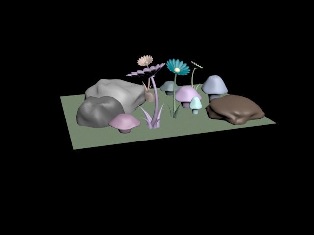 Tutorials The most useful tutorial I've seen is the tutorial that makes the spaceship. I find it the most useful because it is one of the most detailed and showed a variety of tools used. For example "Inset" which makes a surface of an object smaller. I've used this a lot in 3D modeling. This tutorial might help me more in the future by showing the basic tools that I can use. The "Connect" feature allows me to add more faces to the object which could be very helpful. Below is an example of what I made with this tutorial. 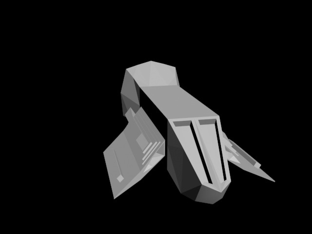 Experience Overall, 3D modeling is okay. I'm sure I would enjoy it better if I could control it more. The teapots are pretty hilarious, and just joking around moving the parts of it is really fun. But for serious projects, probably isn't the best for me though. Difficulties A lot of it is not very easy to me since I'm more use to 2D works. I can make basic 3D shapes and such. Although perspective and moving things around is difficult to me. Especially changing and altering the shapes is incredibly difficult. Rendering is an okay process to me. I could probably figure it out as I go, but I don't know it off the top of my head. But I made a lovely elephant. His name is Elliot (image below). 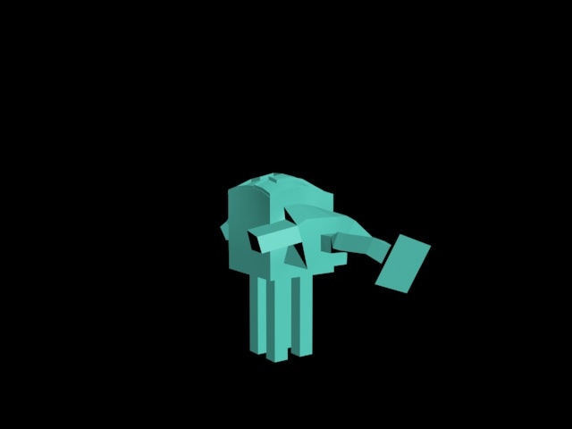 Knowledge Knowledge I've gained that has been most useful in creating the product of my projects is coloring since it has been the majority of the project. I've mostly learned how to draw things from various tutorials, such as changing the layer style to multiply or darken to add color while simultaneously letting the line art show through. I've also figured out that Linear Dodge (Add) helps create highlights/glare on metal that also shows a little hint of color. I've added more detail to the face and tried to dull details on the other aspects as to bring attention to the soldier's face. When I started learning about color theory, an article I remembered was to use nature as an example because nature makes the best color pallets. Which was rather true, since naturalism is gorgeous. So for the robots I decided on a cherry blossom/rose petal type of theme with pink, green, and white. Below is the project. 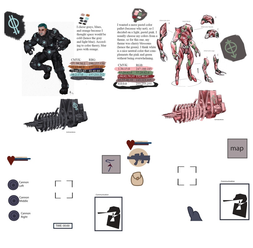 Techniques
Some techniques I learned more in depth in class is coloring using filters and color theory. I learned how to use Photoshop's effects, such as outer glow. Although I've learned a lot outside of class using tutorials. I've learned how to color human faces relatively realistic which really helped color the drag queen soldier's face. Software My preference of software is Photoshop because I'm more accustom to using a tablet in a bitmap software. I prefer Photoshop because I think it's more natural and flowy like drawing on paper, which I have more practice on. Rather than line segments in vector images, which for me, is more bulky and awkward. Comparing and Contrasting
Some key differences between raster and vector images is that vector images are created mathematically. They are created through line segments and can be resized without hurting the quality. Raster images use pixels to create lines, so when they are resized the lines get blurry and so the quality decreases. They are similar because they can create beautiful images. You can render similar shapes in both of them. But for vector images you can change the curve of line segments. Preferences I prefer raster images because I'm more use to making raster images. I can blend and use more of a gradient to shade. I can understand the appeal of using vector images though, if I use vector images for a decent amount of time I can create nice drawings using cel shading (also known as cartoon shading). But I still prefer raster for the amount of soft details I can put into it. Color Theory I knew most things (to a certian degree), for example, color is in our heads. It would explain why some animals can see more colors than us, like the mantis shrimp, or can't see as much as us, like dogs. I didn't know that no device can truly reproduce all visible colors. I found this to be quite fascinating. Personal Colors The color that appeals to me the most is the color blue. Ever since I was a kid I always liked blue the most. I think it's the most aesthetic and versatile color. For example blue can't get muddy by making it darker or adding grays like orange and yellow. I especially like deep shades of blue. Blue is very calming. What I learned is blue is the most popular color, especially among men. Blue people tend to like familiarity and predictability which is especially true for me. I don't like change. At all. They are also clean and organised in what they do and in their home. Blue people respect and obey the rules (I'm sure this just depends on childhood and upbringing). Loyalty is also a trait that keeps popping up for blue people. Below is a graphic about the color blue 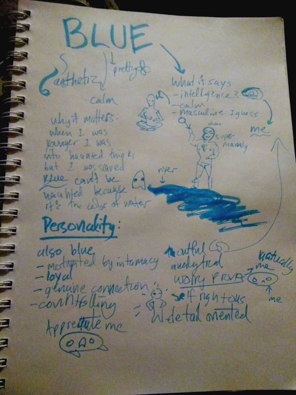 |
AuthorMy name is Clarice, I'm a high school student. My main focus is art- 2D and game design. Archives
September 2017
Categories |
 RSS Feed
